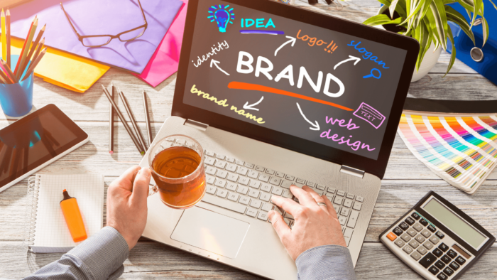
If you’re anything like me, you love to collect “swipes” that you can pull inspiration from for your own branding and marketing. That’s why I wanted to share with you my curated collection of dazzling brand design examples that have given me so much inspiration.
I think they’ll inspire you too 🙂
We’ll look at some big brands, some not-so-big brands, and a few smaller, unique ones.
Now, whether it’s a giant corporation with a multi-million dollar brand image, or a mom and pop startup with a cute story, brand design matters.
But, there’s more to a knockout brand design than a set of guidelines from a pricey marketing agency; there’s also heart and soul behind all great branding — remember that as we move forward.
That said, let’s dive into these examples and stir up some branding inspiration!
1. Oatly
Oatly is a Swedish company that produces dairy-free oat milk products.
Let’s face it, oat milk isn’t exactly the most exciting product in the world.
However, Oatly’s punchy and hilarious branding turns oat milk into a non-stop thrill ride.
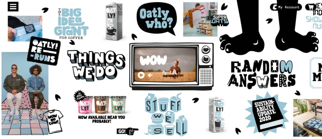
Believe it or not, Oatly has been around since 1994. But, the company only started to make waves on the international market after a massive rebrand in 2012.
Their strategy?
Using loud visuals and irreverent copy to deliver an upbeat and addictive brand voice.
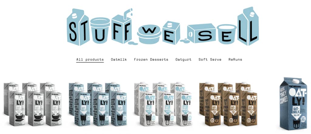
Everything from Oatly’s content to their packaging features their bold, eye-catching logo and personality-packed graphic design
Despite the wild visual experience, Oatly’s brand design is cohesive in the most chaotic way possible.
To say Oatly’s branding is fearless, intense, and unique is an understatement.
2. Apple
Apple is one of the world’s most popular brands.
Why?
Emotionally-driven brand positioning and majestic brand design.
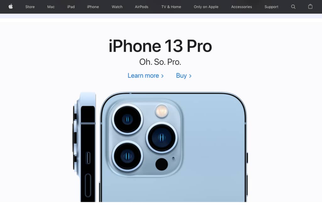
Take one look at Apple’s website, and you’ll see short, sweet, benefit-rich copy peppered on every page.
Although Apple nails the trinity of great copywriting — conciseness, clarity, and creativity — there’s another equally important element to Apple’s branding:
Product photography.
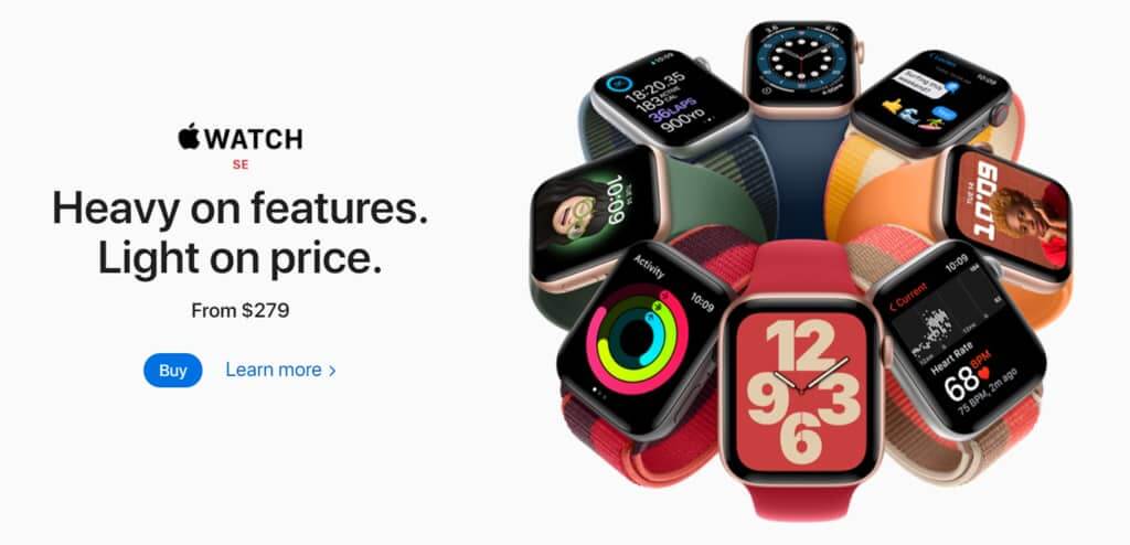
If a picture says a thousand words, Apple’s product photography says a million.
Not only does Apple’s product photography showcase the sleek and sexy designs of its various devices, but almost every photo pulses with alluring energy, seducing you into thinking that you not only want this product, you need it.
Whether you’re an Apple addict or critic, you have to admit, their branding is something special.
3. Netflix
214 million.
That’s the total number of Netflix subscribers around the world in 2021.
And that doesn’t even count the people leeching their friends and family members’ accounts!
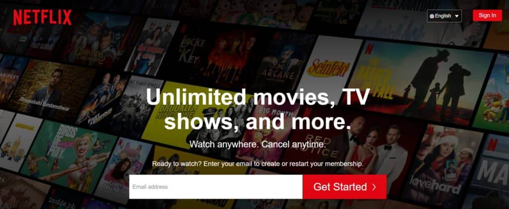
So, what makes Netflix branding so popular?
Other than being a pioneer for online streaming, Netflix has something that completes every expertly crafted brand design:
An iconic logo.
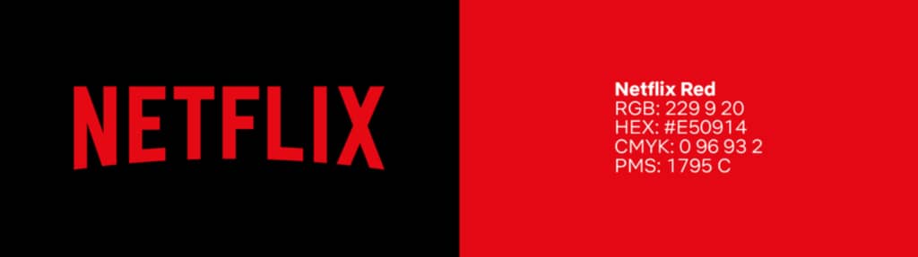
Modeled after the CinemaScope logo from the ’50s and ’60s, the arcing red Netflix logo is the company’s signature. It has a single color code, “Netflix red,” as well as strict graphic design rules.
But Netflix’s visual branding doesn’t stop there. The company also has a secondary logo, the red “N”, a powerful symbol that according to Netflix, “transcends language and culture.”
Combined, the Netflix logo and red “N” symbol have cemented the company’s visual identity and helped it become one of the most recognizable brands on the planet.
4. Magic Spoon
Magic Spoon sells healthy, high-protein, low-carb breakfast cereals.
A quick look at their branding, and you’d think they’re a product for kids.
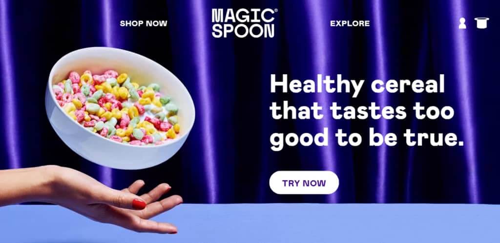
In truth, Magic Spoon’s playful imagery and whimsical purple and pink color palette is designed for the kid at heart.
You see, healthy breakfast cereal is normally targeted to people who worry about “staying regular”.
But Magic Spoon breaks rank with the “staying regular” crowd and instead tries to evoke those fun, happy memories we all had as kids. It’s still a healthy cereal, but with less emphasis on fiber and more on fun.
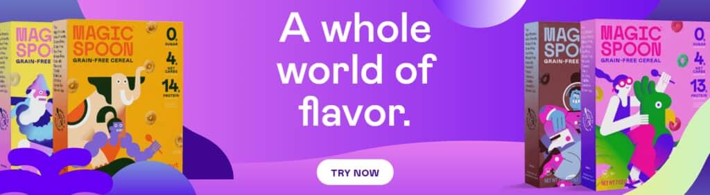
Magic Spoon’s branding is all about making you feel like a kid again. And with zany illustrations, a wild color palette, and product photography that feels straight out of a Saturday morning cartoon, Magic Spoon is truly magical.
5. Uber
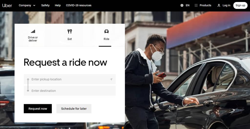
Uber’s current branding doesn’t use flashy visual elements or an eye-catching logo to promote its brand.
Why?
Because Uber is recognized around the world.
Heck, it’s even a verb now:
“Do you need me to pick you up?”
“No. I’ll just Uber.”
Now, despite taking a minimalist approach, Uber’s brand style guide uses 9 core elements. Of these design elements, photography paints the most detailed picture of the company.

According to Uber’s photography guidelines:
“Our photography inspires our audience of young and old, rich and poor, customers and partners, local and global. Clarification of how Uber works is unnecessary. We build on how it feels to move from motivation at point A to the emotional payoff arriving at point B.”
In other words, instead of telling you what Uber is and how it works, the company insists that photos capture the emotional benefits you’ll receive when using their services. Talk about a subtle but powerful way of saying:
We know you know us, and here’s why you’ll love us.
6. PayPal
PayPal has been in the digital payments business since 1998.
They’re arguably one of the most recognizable fintech companies for a few reasons: innovation, utility, and distinctive branding.
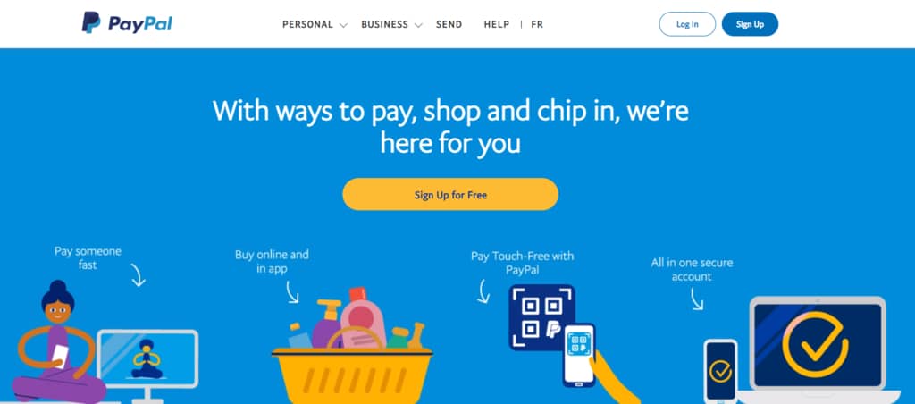
Two of PayPal’s most recognized branding elements are:
- Its blue color palette
- Its overlapping “double-P” logo design
PayPal blue is fused into every bit of the company’s content.
Why blue?
Because people associate blue with trust. It’s part of the reason you’ll see blue color branding for cybersecurity, healthcare, and finance companies — because if people don’t trust your company in these industries, you’re toast.
7. Moshi
Moshi is a sleep and mindfulness app that helps kids relax and fall asleep faster using narrated stories and tranquil sounds.
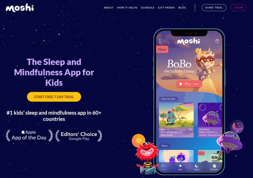
Moshi’s branding is beautiful. The dark colors and soothing imagery serve the brand’s purpose of helping with sleep and relaxation.
The charming, animated characters add personality to the platform and help establish Moshi’s unique identity and visual branding.
Moshi’s cute creatures aren’t just for show; they’re also the central characters in Moshi’s bedtime stories, and many have their own branded collections of relaxing sounds.
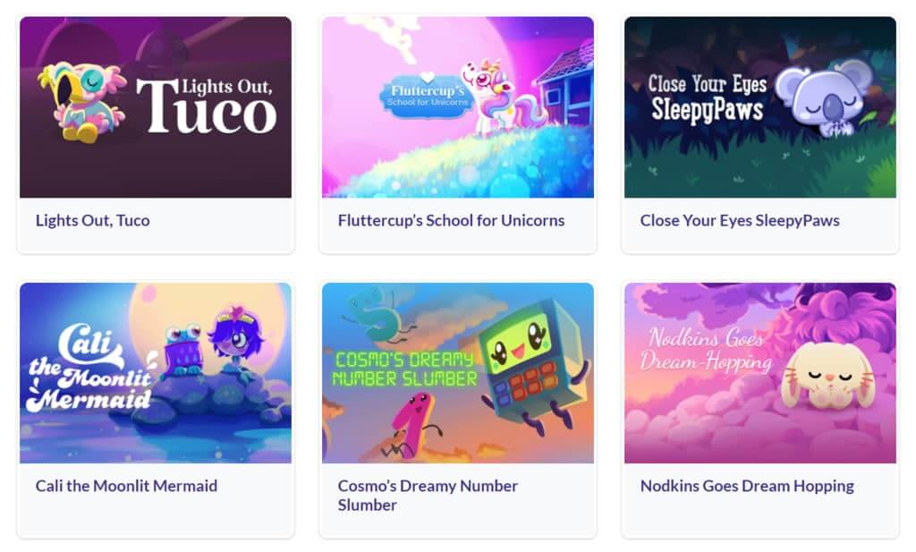
The bottom line is that Moshi is all about the characters.
Not only are they Moshi’s most important brand assets, but without characters like Darwin Dodo, Fluttercup, or Nodkins, the platform likely wouldn’t appeal to its target audience, kids.
8. Slack
Slack is a popular business communication platform.
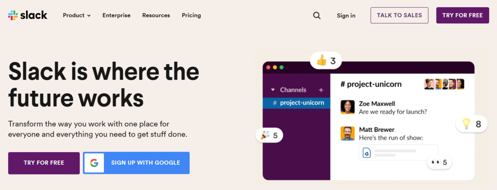
Fun fact: Slack is an acronym for “Searchable Log of All Conversation and Knowledge.”
Slack’s brand design represents the company’s creative, curious and collaborative culture.
While Slack’s multicolored “octothorpe” logo helps with brand recognition, its “aubergine” (eggplant) purple brand color is the company’s breakout visual design element.
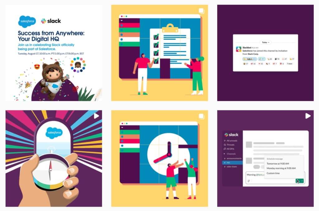
Nearly all Slack’s content across its website and social media pages integrate this distinctive purple color. And when they want to kick things up a notch, they’ll weave the colors from the logo into images, creating a truly cohesive experience!
Slack is an excellent example of how a single brand color can be the driving force behind a recognizable brand design when integrated into content tastefully.
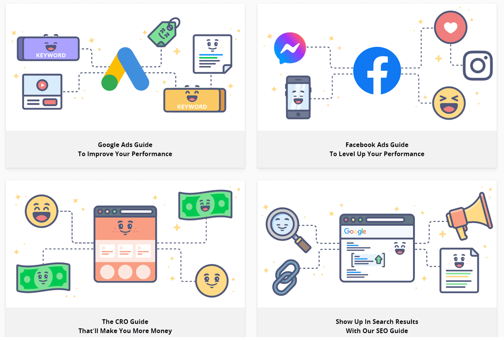
9. KlientBoost
KlientBoost is a digital marketing agency, offering paid advertising, SEO, email marketing and copywriting services.
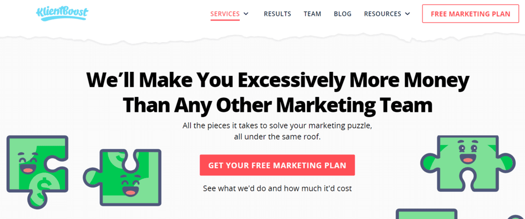
Take a peek at their website and you’ll notice colorful, happy iconography and illustrations scattered about.
Whether it’s a stack of money or a magnifying glass, every illustration has a happy face, insinuating that KlientBoost delivers happiness to their clients.
What’s more, team member photos show a fun-loving culture filled with enthusiasm; the sort of people who love their jobs, and exactly the kind of engaging personalities you want crafting your marketing campaigns.
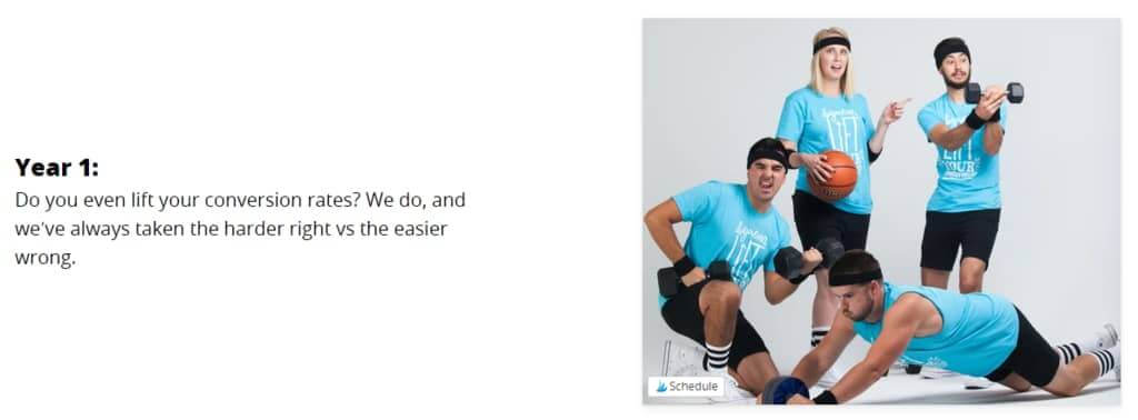
It’s hard not to smile, right?
10. MailChimp
Mailchimp is a popular marketing automation platform and email marketing service for small businesses.
When it comes to marketing, Mailchimp’s style guide is a celebrated resource for learning how to write clear, consistent content.
But what about their brand design?
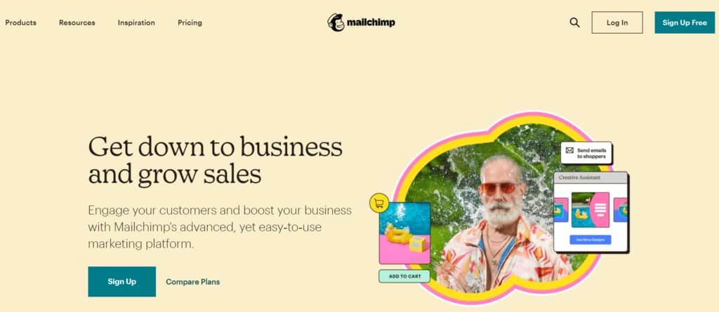
First, you’ll notice their logo, “Freddie the chimp,” on a Cavendish yellow background — talk about standing out, right?
From there, you’re hit with a sonic boom of imaginative imagery and clever copy written in Cooper Light typeface.
Every page contains expressive, hand-drawn illustrations that, at first glance, seem like creative risks.
But as you venture further into the Mailchimp jungle, you soon realize these funky doodles capture the emotional benefits of using their services and also serve as creative inspiration for Mailchimp’s target audience.
What Brand Design Example Wowed You?
Let me know in a comment below!
And while I’ve got your ear, tell me about your branding.
Do you have wonderful and woe-worthy visuals that make your target audience swoon?
Or maybe you’ve got a slick brand logo that gives you an edge over your competitors.
And if you’re a personal branding powerhouse, feel free to share your style.
I can’t wait to hear from you!
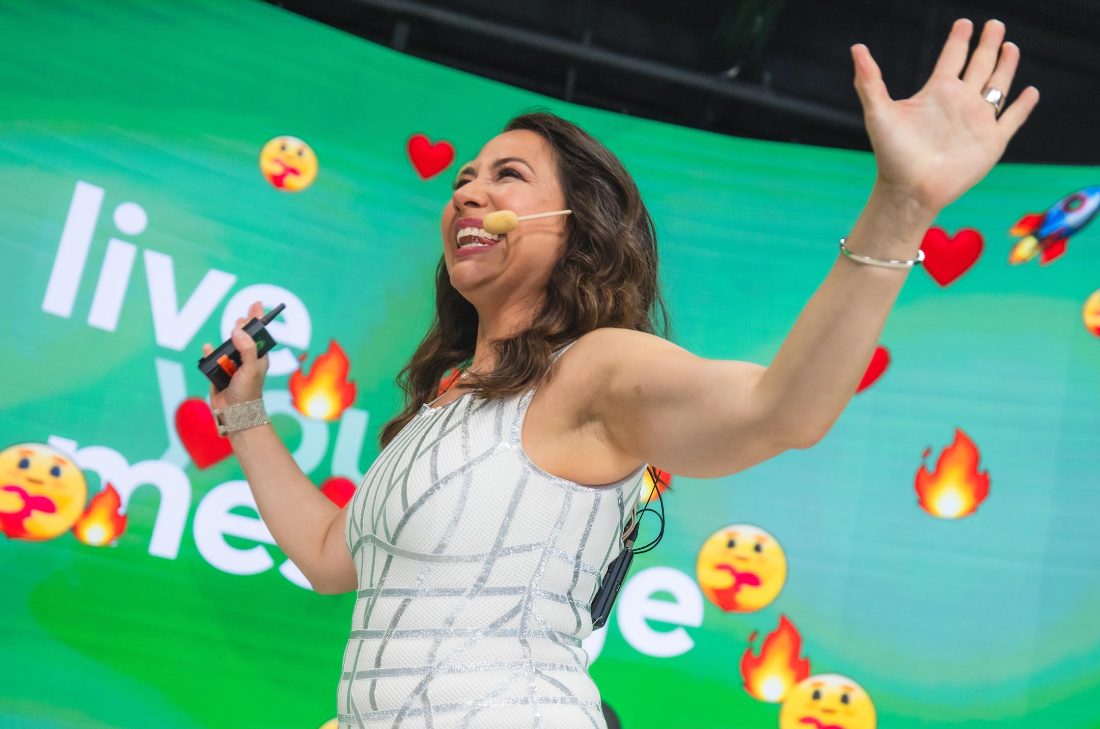
Ready to really grow your business and your impact? Then, join me for the ONLY business-building event where you’ll leave with a shorter to-do list than when you arrived!
I’ll be sharing exactly how to hone in on what to say, do and sell next in order to grow your business — with proven strategies that I’ve spent over a decade testing.
In fact, this is the ELEVENTH annual Live Your Message LIVE, and many students come back year after year — because the strategies keep working!
We’ll spend 3 days together virtually, working on your business and YOUR unique growth blueprint. As my premium business growth and networking event, tickets routinely go for $1,000 since the information is that valuable.
But today, your ticket is just $147! Grab your seat here.
You’ll ALSO receive your very own copy of my valuable Message to Money Pathway — your unique, highly-customized template that will guide you by the hand to your 6 or 7-figure business (regardless of where you’re starting from).
You’ll Zoom in “overwhelmed” and Zoom out with an exact roadmap for what to say, do and sell next to grow your business in 2023. Here’s the link again to grab your ticket.
See you virtually March 3-5, 2023 🙂
Love it? Hate it? Let me know...
-

I have been following you for a few months now and you are a treasure trove on insight and incredible knowledge. This is such invaluable information especially since I am a solopreneur with little money and time. Not only did I discover a company that can help me in my business, I also discovered an app that can help my children settle down at night. Thanks for being you and doing what you do.
-
Thanks so much, Ibby! This is why Marisa does what she does 🙂
-
-
I have been a fan of Apple since The 80’s and now love to see PayPal and Mailchimp. And now, everything Marisa does! Wheeee!!!
-
Thanks, Ernie! Marisa definitely appreciates it 🙂
-
-
I’ve been browsing online greater than three hours these days, yet I never discovered any interesting article like yours. It’s beautiful worth sufficient for me. In my view, if all site owners and bloggers made just right content as you did, the web can be much more helpful than ever before.
-
I love your blog.. very nice colors & theme. Did you create this website yourself? Plz reply back as I’m looking to create my own blog and would like to know wheere u got this from. thanks
-
Yes, we did!
-
-
Simply wanna say that this is invaluable, Thanks for taking your time to write this.
-
So thrilled to hear that! Thank you for sharing!
-
-
I wanted to thank you for this great read!! I definitely enjoying every little bit of it I have you bookmarked to check out new stuff you post…
-
Awesome! Thank you for sharing!
-
-
I gotta bookmark this site it seems handy invaluable
-
Thank you!
-
-
I have read a few good stuff here. Definitely worth bookmarking for revisiting. I surprise how much effort you put to make such a wonderful informative site.
-
Thank you for reading and sharing! Thrilled you find our site so valuable!
-
-
I am extremely impressed with your writing skills and also with the layout on your blog. Is this a paid theme or did you modify it yourself? Either way keep up the nice quality writing, it’s rare to see a great blog like this one nowadays..
-
Wow, thanks for the love! Marisa and the team appreciate it so, so much! We did modify it ourselves… we actually revamped the entire site in September.
-
-
Really enjoyed this article, how can I make is so that I get an email sent to me whenever there is a fresh update?
-
Be sure to join our email list! You can sign up in the banner at the top of our site: https://liveyourmessage.com/
-
-
I went over this site and I conceive you have a lot of good information, bookmarked (:.
-
So glad to hear that!
-


Leave a Comment