Looking for a list of great brand guidelines?
From Coca-Cola’s red and white script to McDonald’s iconic golden arches logo to Nike’s catchy “Just do it” slogan, a distinctive and well-executed brand guideline enables companies to stand out from the crowd and “stick” in the minds of customers.
In this post, I’ll shine a spotlight on 11 top-notch brand guidelines from some of the world’s most well-known companies.
Let’s dive in.
1. Asana
![]()
Asana is a productivity software platform designed to support teams by organizing, tracking, and managing their work. It launched commercially in April 2012, and you’ll find it in web and mobile applications.
The company is doing something right, as evidenced by its valuation of $5.5 billion in 2020.
So what does Asana mean?
Asana is the Sanskrit name for a yogi’s sitting pose. It conveys the ability to stay centered amid distraction.
Asana’s logo is excellent at marrying its culture of creating ease, flow and focus to a work team setting — summed up cleverly with the three red coral dots.
Its brand style guide reminds you in a casual tone how to apply the Asana logo.
2. Google
![]()
What is the most powerful multinational American company in the technology space?
It’s Google.
Best known for its search engine or email service (see “Gmail”), Google’s also known for its work in:
- Artificial intelligence
- Mobile hardware
- Online advertising
- Cloud computing
- Computer software
- Quantum computing
- E-commerce
- Consumer electronics
The color palette of Google’s logo follows the primary colors of blue, green, yellow and red. Google’s idea was to present its company in a simple, non-threatening, young, fun, approachable way to engage with technology.
The initial logo, the full name of Google, has now been condensed to make it simpler for smaller spaces.
And the dots represent the dynamic thinking, assistive or transitional aspects of the platform in use. Also, you’ll see the dots bouncing when you query a search on your tablet or phone.
3. Slack
![]()
Slack is a collaborative software platform that brings instant messaging to workplace teams and facilitates the exchange of files. This technology allows groups to unite in a cohesive setting that organizes communication based on projects or similar work objectives.
Slack’s values include empathy, courtesy, craftsmanship, playfulness and solidarity — all of which are contained within its brand guidelines templates.
Its logo, which has been newly redesigned, better matches the company’s vision of thriving collaboration.
The new logo consists of four brand colors, green, red, gold, and blue and four tiny bubbles and four rectangles — a much-needed improvement over the old hashtag logo that was angled, included eleven colors and was hard to duplicate precisely.
4. Netflix
![]()
Netflix is a subscription-based technology that allows you to watch movies, original series and documentaries without the hassle of leaving your home and physically going to a movie theatre.
Its logo invokes the feeling of going to the cinema while staying home in your pajamas. With an iconic red and cinemascope logo design, Netflix is a brand that most people can instantly recognize.
In fact, Netflix will often use the simple “N” emblem instead of its logo because the font and color are so recognizable.
![]()
5. Medium
![]()
Launched in 2012 by Twitter’s founder, Evan Williams, Medium is a free and subscription-based platform for publishing articles online. It acts as the world’s most prominent social blog while boasting 175,000+ writers and 100+ million readers.
One of Medium’s major draws is its ability to offer content from writers with all different backgrounds — from amateur to professional writers. In addition, Medium’s digital publishing platform creates a safe space that’s free from advertising.
Medium’s logo mimics its illustration font, and the symbol is born from ellipses — “a punctuation mark that represents an unfinished or impending thought, an idea to come, what’s next.”
6. Spotify
![]()
Spotify is a digital streaming platform for music, podcasts and other content used by creators worldwide to gain exposure in markets they may not have access to in their native countries. They are one of the world’s largest music streaming platforms.
Spotify’s tiered paid subscription plan gives you access to its robust algorithm — matching you to content aligned with your current taste for music and podcasts. In addition, it allows you to organize and build collections of music and content to access anytime from their multiple app options, including mobile and desktop.
Its iconic logo is simple, which gives it a modern flair — a green circle with three lines representing sound waves and the words Spotify in a sans serif typography font.
7. Skype
![]()
Founded in 2003, Skype is part of the Microsoft family.
Skype allows people to connect for free via video, live chat, and instant messaging through the internet. This technology is considered a VoIP service (voice over internet protocol) — it bypasses traditional landlines and cellular plans.
Skype’s brand assets, including its logo, are playful — encompassing a conversation bubble and comic book feel. Its brand standard guide is easy to read and a departure from the rigid rules and regulations that other companies tend to lean.
8. Mailchimp
![]()
Mailchimp got its start in 2001. Ben Chestnut and Dan Kurzius, founders of the company, started Mailchimp as a side hustle for its web design agency.
Ben and Dan developed their software as a solution for small businesses to bypass the expensive early email tools present in the 2000s.
Today they are an award-winning all-in-one email marketing platform with functionality that includes a Marketing CRM, social posting digital ads, websites and advanced automation.
What’s great about Mailchimp’s branding is the approachability of the iconic chimp named Freddie. Its wordmark got a new refresh in 2019, duplicating the Mailchimp logo and making the graphic design more straightforward. In addition, they’ve added animations to bring content more to life in abstract form to serve its ever-expanding creative community.
9. Boy Scouts of America
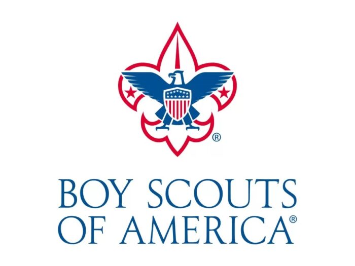
Founded in 1910, the Boy Scouts of America (BSA) is the world’s largest scouting organization with 2.2+ million participants and 800,000 adult leaders.
The values consistent throughout the organization and brand standards are trustworthiness, adventurous, patriotic and faithful.
And if a Scout were to approach you, these are the characteristics they would exude. In addition, you will find them devoted to service — for example, helping someone across the street or pointing someone in the right direction.
BSA’s brand identity guidelines and logo usage represent a trademark that unifies an organization of this size. Their symbol is a fleur-de-lis with an eagle, shield, 13 stars and stripes and two five-pointed stars — a strong symbol that carries the “Prepared for Life” tagline.
10. Twitter
![]()
Twitter is a micro-blog that marries well with today’s short attention span and is used as a free social networking site or an amateur online news outlet.
Tweets are the jargon used to reference communication on Twitter and are limited to 280 words — thus, staying true to the micro-blog theme.
What’s made this platform so popular?
People can follow and keep abreast of happenings without in-depth reading or discovery.
Its visual identity represents a company aligned with self-expression where people can publicize their ideas and opinions, fight for causes, and join conversations.
The iconic tweet bird symbol sums up this social communication tool. And the brand manual is straightforward, letting you know its wildly popular logo’s do’s and don’ts.
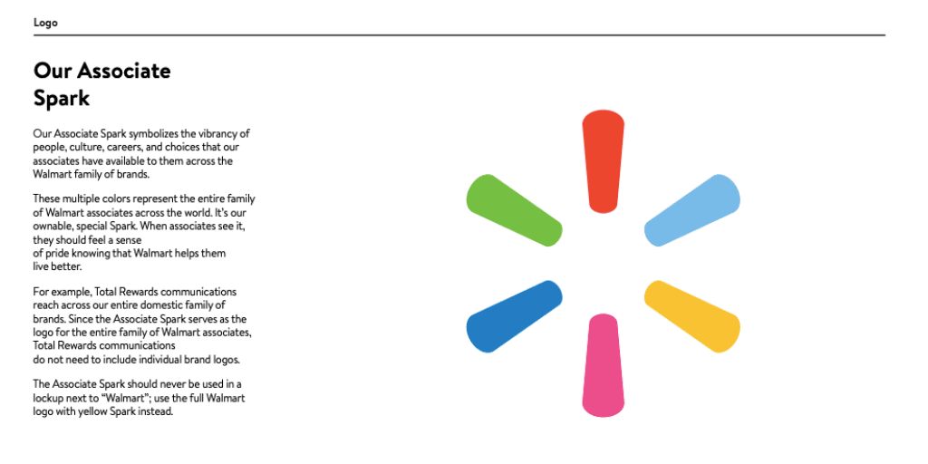
11. Walmart
![]()
Walmart continues to be one of the world’s largest companies based on revenue of $570 billion and ranking as a Fortune 1 company for ten years and running — beating out companies like Apple and Amazon. And if this weren’t impressive enough, Walmart employs over 2.3 million associates worldwide.
Recognizable as a hypermarket, grocery and discount department store, Walmart is a retailer you can find typically located in any small town USA. And with its impressive expansion into the digital eCommerce world, Walmart continually enjoys success as a clear leader in the retail market.
Due to its largess and commitment to employees’ experiences, Walmart incorporates different brand standards for its internal communications and marketing material. “We have a specific approach that captures our fresh, always-Walmart spirit” is the claim in its brand guide. And you’ll find this echoed in its Spark Logo.
Which of These Brand Guidelines Inspired You the Most?
Do you have a favorite?
Did one brand guideline stand out to you more than the others?
Are there some great brand guidelines I missed?
Let me know in a comment below!
Related Reading:
77 Must-Know Branding Statistics for 2022
13 Strong Personal Brand Examples (+ Actionable Takeaways)
The Ultimate Guide to a Powerful Personal Brand
And if you’re ready to take your brand to the next level… then join me for the ONLY business-building event where you’ll leave with a shorter to-do list than when you arrived!
I’ll be sharing exactly how to hone in on what to say, do and sell next in order to grow your business — with proven strategies that I’ve spent over a decade testing.
In fact, this is the ELEVENTH annual Live Your Message LIVE, and many students come back year after year — because the strategies keep working!
We’ll spend 3 days together virtually, working on your business and YOUR unique growth blueprint. As my premium business growth and networking event, tickets routinely go for $1,000 since the information is that valuable.
But today, your ticket is just $147! Grab your seat here.
You’ll ALSO receive your very own copy of my valuable Message to Money Pathway — your unique, highly-customized template that will guide you by the hand to your 6 or 7-figure business (regardless of where you’re starting from).
You’ll Zoom in “overwhelmed” and Zoom out with an exact roadmap for what to say, do and sell next to grow your business in 2023. Here’s the link again to grab your ticket.


Leave a Comment